Highland Poverty and Equality Commission
Turning complex evidence into clear calls to action, The Highland Poverty and Equality Commission set out to create a report that did more than present evidence, it needed to clearly make the case for change.
The Brief
With lived experience at its centre, the report brought together research, personal stories, statistics and recommendations around some of the most important issues facing communities across the Highlands. The challenge was to make this complex and sometimes difficult subject matter accessible to a broad audience, from professionals and policymakers to young people and communities. The report also needed to feel different from a traditional policy document: authoritative enough to carry weight, but engaging enough to encourage people to read, understand and act on its findings.
Our Work
Our role was to take a substantial body of content and develop a clear, creative framework that could give the report its own voice and personality.
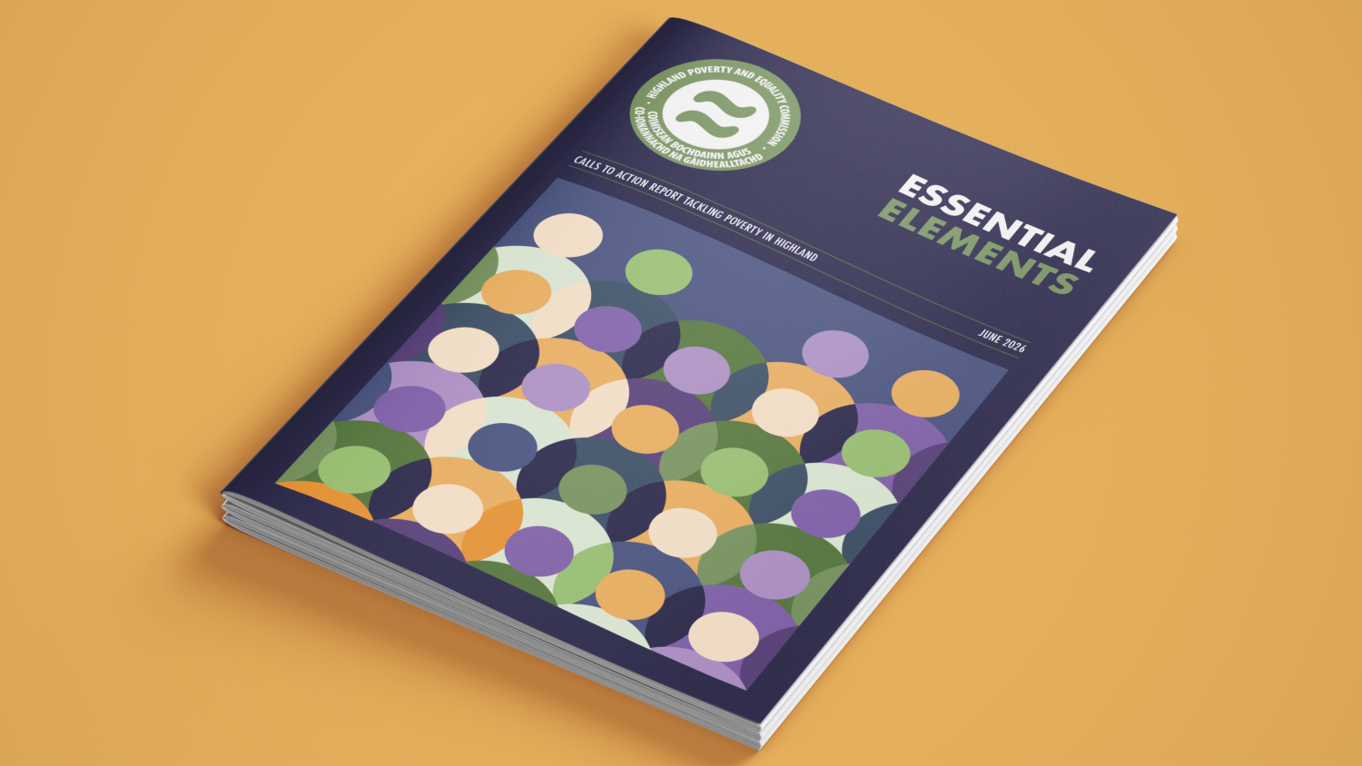
We developed a visual language built around people, places and prospects. A modern illustration and icon system provided a human, accessible quality, while colour and graphic devices created a consistent way of navigating the report's different themes and priorities.
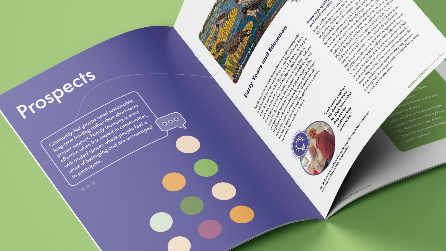
We also identified opportunities within the content to create moments of emphasis – using pulled-out quotes, statistics, calls to action and information panels to bring important messages forward rather than allowing them to become lost within lengthy sections of text.
Bespoke graphics, including a Highlands map and timeline, provided context and told the story visually, while a carefully considered layout gave the report space to breathe.

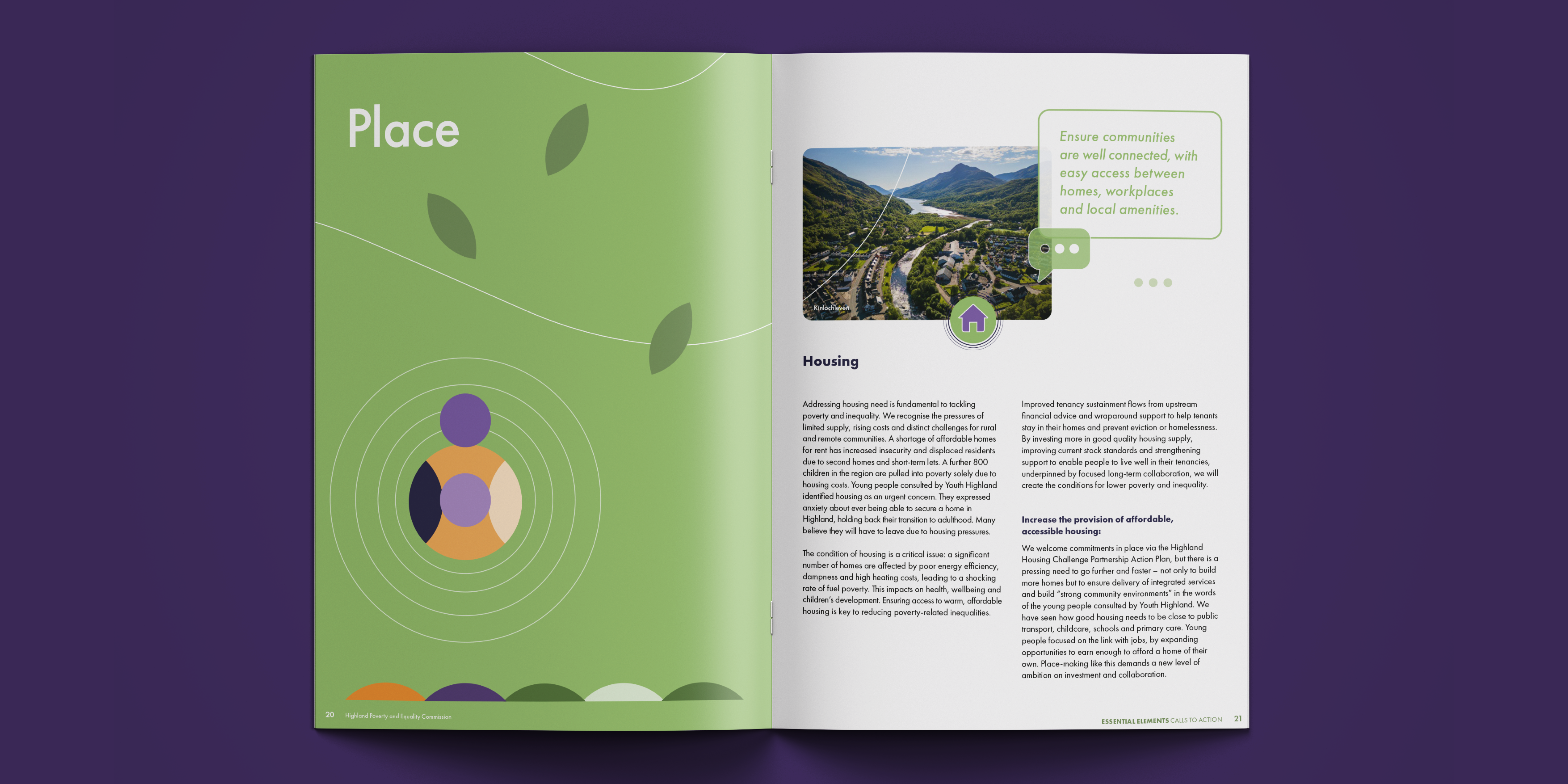
A key part of our approach was thinking from the reader's perspective. We considered how someone might scan the document, where their attention would naturally fall and how we could create clear entry points into the content. We introduced different visual treatments to distinguish evidence, lived experience, key findings, and calls to action.
This helped transform what could have been a conventional and lengthy policy report into something more accessible, engaging and purposeful, allowing the design to support the Commission's message rather than simply present it.
The Results
Dynam created a distinctive visual platform for the Commission's work, balancing the credibility of a policy report with a warmer, more human and accessible approach. The result was a design approach that could handle a wide variety of content while maintaining strong consistency and identity throughout.
Most importantly, the design was created to help the report communicate, not simply contain information: giving prominence to lived experience, making evidence easier to navigate, and turning the Commission's recommendations into clear, engaging calls to action.
A very big thanks for the design flair you’ve brought to the report, and for going the extra mile in terms of turnaround times and flexibility. The report is already being recognised as impactful and for its top design quality.
Jim McCormick
Chief Executive Officer
The Robertson Trust